1.
This is a form of collage artwork, using found paper objects such as labels, pricetags, tickets.
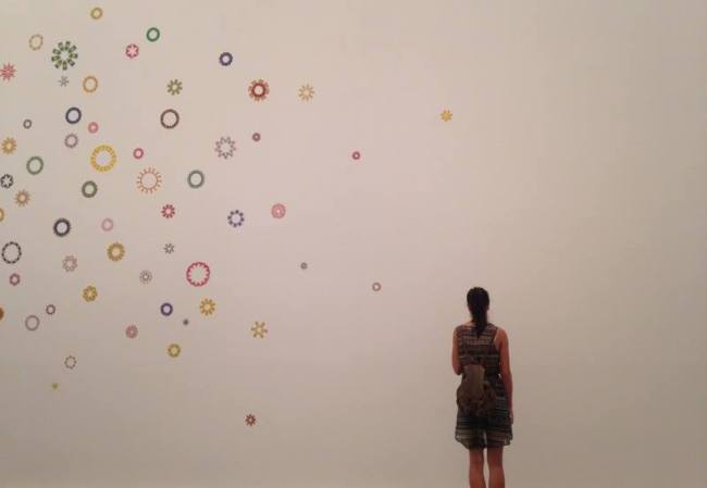
Elizabeth Gower, 150 Rotations, 2013. housed in the Courtney Sutton Gallery, Melbourne and the Milani Gallery, Brisbane.
2. The individuals artworks are not very large, however as there are multiple pieces, together they contribute to the whole wall in the gallery. The scale in relationship to the human figure is very large. Standing next to the collage, you are drawn into the details that span across the whole wall, however you have to move along the wall and peer at each individual wheel to notice the details. It’s only then do you realise what each wheel is made of, and that is everyday items, such as teabag labels, price tags, junk mail and other fragments. When looking from a distance and taking it all in, it’s really very pretty and very feminine. Only on closer inspection do you realise it’s made up from disposed of items. In comparison to the art displays surrounding it, it seems to be of slight contrast. The other installations are very industrial, scientific displays, that require some interaction, unlike this one. The wall opposite contains very detailed line prints, and in comparison this display seems very simple, when the others are so busy and overpowering. But in reality it’s not so simple, it’s quite detailed and does require a bit of time spent on it. The artwork is simply lit with the rooms lighting, which is quite natural and bright.
3. The materials used in this artwork consist of teabag labels, pricetags, junk mail and other fragments. They have all been stuck on the wall in circular shapes, in someway resembling flowers, stars, or suns, it’s reminds me of a kaleidoscope or even cogs in a machine, and it’s quite mesmeric.
4. Mentioned above.
5. Art elements :
Shape and colour. All the pieces have been composed into circles, and as all the single elements comprise of various shapes, such as squares, ovals, rectangles, such as the teabag labels, all the final circle compositions are different, yet their individual uniqueness is what makes it effective. The colours are quite light and very pastel and bright. There are many colours in it, yellow, purple, green, pink, red. It creates for a very pretty display, and it’s quite mesmerizing.
6. Art principles:
Repitition: This principle is obvious as the wheels repeat over the wall. They are each different, but in their uniqueness create a beautiful pattern.
Space/Movement: The positioning of the patterns over the wall varies. In places it is very condensed and it slowly pans out, with only a few smaller circles on the outside, spaced very far apart from the rest. It creates a gentle movement in the piece and urges one to walk on and continue to inspect each element. The smaller sized wheels cause you to walk in close, and with the larger ones you find yourself stepping backwards to take in the whole wall.
7. Even though it takes up a whole wall, it doesn’t feel overwhelming at all. It has a tranquil calmness to it. I think it is the colours and the spacing that creates that feeling. The pastel colours are very calming and the circle shapes are soft and mesmerizing.
8. Elizabeth says that her artworks are heavily influenced on her surroundings and travels. In this artowork she explores the theme of consumerism and consumption which she has been continually exploring since the late 1970’s. She said in a recent article featured in The Age, “They become symbols of affluent 21st century living and mass production. I’m representing the clutter, the information-overload, making sense of it, but also being seduced by it.” In similair fashion, other artists throughout history have had this same approach to their artwork, such as Andy Warhol who was famous for his artwork that represented the consumerism. Gabriel Kuri is also another artist who sets a similiar pace to Elizabth. He also creates sculptures and collages from remants of everyday purchases and objects, such as receipts and retail supplies. It also reminds me of the Dada movement, where everyday objects were thrust into the public eye, and where it doesn’t follow any set rules, DuChamps urinal first came to mind.
9/10 Elizabeth works mainly in geometric patterns made from paper cut artworks. All her artworks are very bold, and very striking visually. They are all generally similar in the materials used and the patterns that are created tend to have a running pattern in themselves. However in her exhibition The Cutting Table 2013, at the Sutton Gallery, she used paper collage but chose to display them in colour order, all placed in plastic containers. It is quite striking and different to her style of creating flat artworks. However, again, there is a similarity. You are forced to walk around the artwork to appreciate it in it’s entirety, which is the case for her other works. They require attention, the details are there and you have to make an effort to notice them. All her artworks are very organized, mathematical even, and apparently derived from the grid layout of Manhatten. It is meant to contrast the theme of consumerism and the commercial world, which can leave behind a lot of trash, in this case paper objects. This is the objective in all of her artworks. To also convey that sense of humility in using huble objects, and conveying a sense of fragility over the theme.
11.
http://www.suttongallery.com.au/artists/artistimages.php?id=13
http://thedesignfiles.net/2012/02/elizabeth-gower/
http://www.theage.com.au/news/Arts/Just-cut-out-for-her-art/2004/11/18/1100748127951.html?from=storyrhs

